Gris-gris by Elisabeth Lebovici, may 2011
In 1954, Jasper Johns painted the first painting in his series of Flags. The idea first came to him in a dream. « One night I dreamed that I painted a large American flag and the next morning I got up and I went out and bought the materials to begin it. And I did. » The dream thus became reality the very next day, with the artist changing medium right in the middle of his work, moving from enamel to wax because with encaustic, which cools very quickly, you don’t have to wait for it to dry between each layer, you can just keep on painting. It’s a very « rotten » painting, says Johns. The painting, Flag, is the flag and it’s not at all the flag. It is that conventional form, that entity of stripes (the original colonies) and stars (the number of states) filling the entire panel. The flag appears « in person » here on the surface of the painting and not by way of imitation or simulation. When you look at a Flag by Johns, you’re not looking at the illusion of a flag, but at the flag itself; painting thus does not play a subaltern role in relation to reality, on the contrary it provides reality’s condition. But you are also looking integrally at some paint, which fills the totality of the surface with its presence, without hiding behind the non-real, behind the fiction of an image. Representation is no longer a barrier to the demonstration of painting’s specificity, as modernism had conceived it: between Johns’ painted flag and the flag flying from masts at embassies, there is nothing more than the thickness of paint and its canvas.
The painting thus unfolds into two equally logical propositions: the flag is the flag, painting is painting. In Flag, both, one might say, are taken in flagrante delicto of painting and the gaze we bring to it. In which case, the interpretation does not matter much: Jasper Johns’s Flags can be both anti-American and signs of the pictorial imperialism of the United States. Both at the same time.
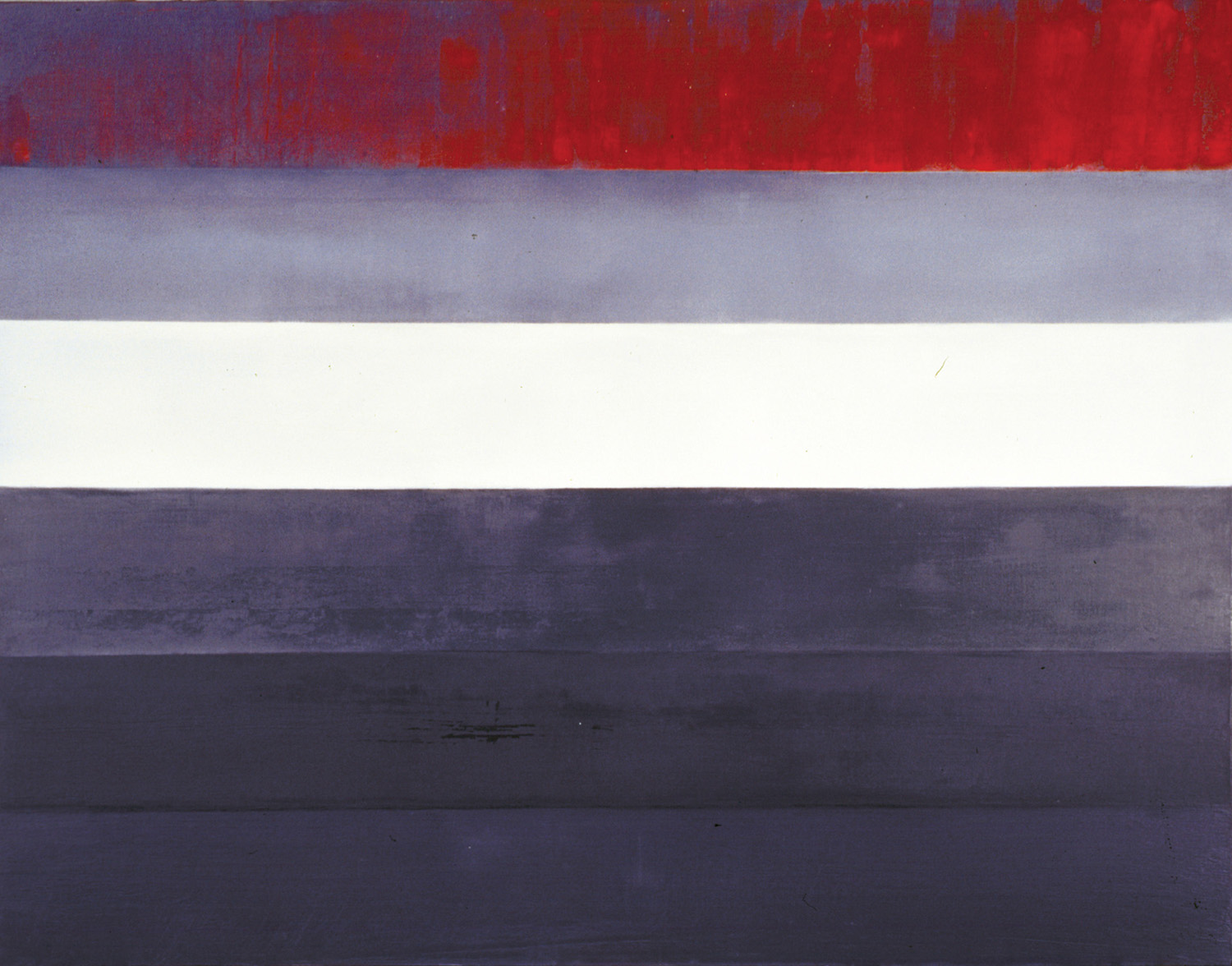
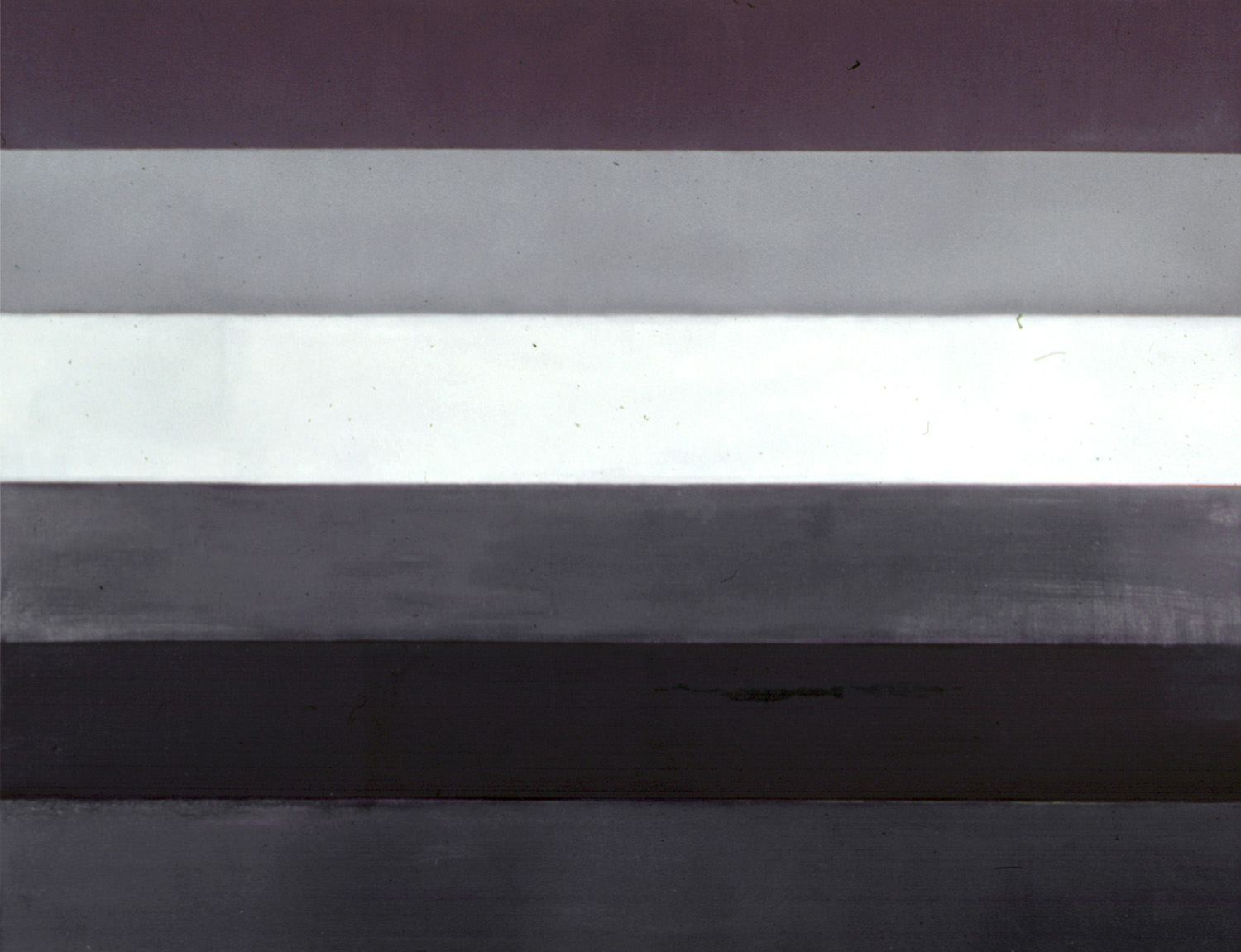
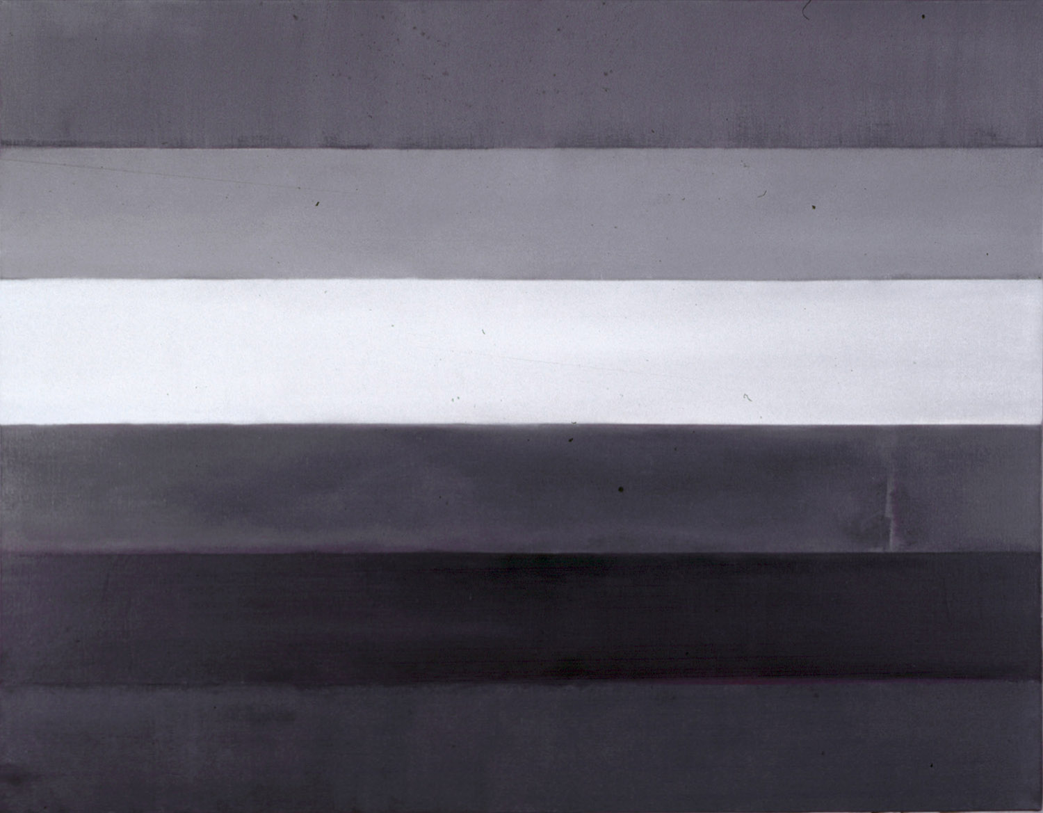
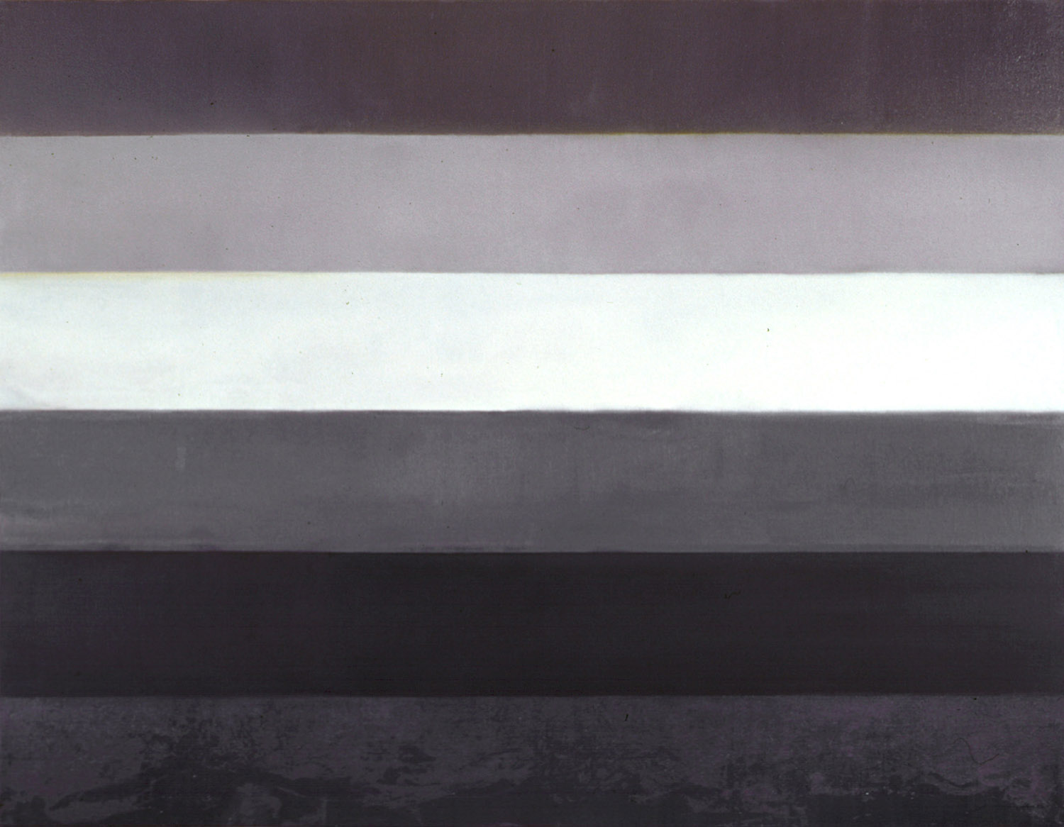
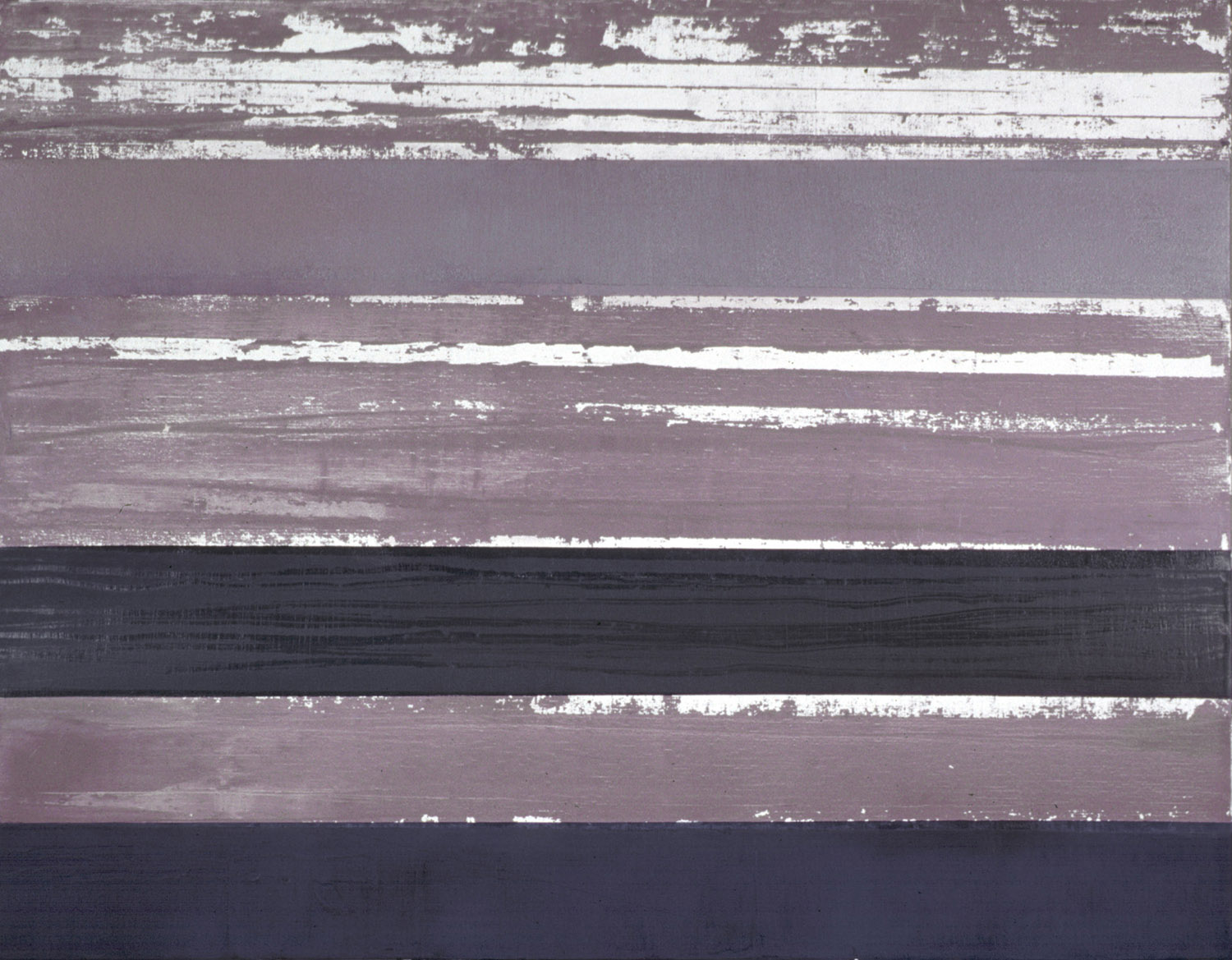
In 2005, Michel Bayetto painted the series Grey Flags. I love the title. They, too, are flags. But not American ones. They do not represent a State, nor even a conglomerate of united States, but rather a state of things: the state of homosexuality, displayed a decade after Stonewall under the banner of bands of colors placed in close proximity to each other. People also talk about Rainbow Flags. « Gay Flag » makes things sound pretty faggy: there’s actually a group of gay cops in France that’s called something like that, I think. Since the Iraq war, but in colors that are a little bit lighter and more transparent, the gay rainbow was taken up in the service of Pace, of peace. But Bayetto doesn’t paint the Gay Flag. He paints shades of grey. In reality, he paints after a black-and-white photocopy of a rainbow flag that it, too, has been reproduced: a transcription into densities of grey of what is presented elsewhere as changes of color.
Phonetically, going from the Gay Flag to the Grey flag involves an « r, » an air, an era that works its way in. From the flag of colors to the grey flag. A political declaration? But of course, in a sad « gay » world moving toward increasing uniformity, or rather, concentrating its energies on monotonous images of grey reforms rather than on a flamboyant revolution. But this « r » also introduces a pictorial declaration. While the colors, to our eyes, are subtracted from the conventional image, the painting is constructed in its polychrome. Were Grisailles not paintings done in the colors of statues?
Alan Charlton (1988): « Grey is the most important thing about my paintings. I’ve never done a painting that wasn’t grey. »
Because grey, in painting, is the antithesis of subtraction.
Quite to the contrary, it is obtained through addition. It is the sum; it’s all colors without privileging any one of them in particular. An additive mix, an addictive mix. Bayetto mixes the three primary colors. After this intervention, the industrialized, normalized, codified shades will literally abstract color, erasing themselves in the interaction with other colors in order to produce grey, in its monotony but also in variations that go from dark to light, from saturated to bright. Grey is the mix of contrasts. Each spectator must then work to scrutinize for nuance and find color once again. Grey has to do with nothing but color.
At the same time, color comes to the surface and appears as a thin line of steam between two stripes of grey, or gets left in the middle of one particular stripe, as a kind of persistence. Contemplating Bayetto’s paintings invites participation in this work of figuring and refiguring colors: a stoic contemplation that goes on, slowly. Infinitely, like the work of painting.
There is grey in color, color in grey, and representation, in its conventionality, is blown away by this: the colors blue, red, yellow, but also green, orange or purple are not « behind » grey, nor are they with it: they are not the remains but instead the products of grey that come from the work of painting. Just as the separation between each horizontal stripe reserves optical surprises of light or dark upon which the painter pictorially insists. Thus, the persistence of colors here becomes a figure and Bayetto does not hesitate to add another layer, of red in one case, of blue in another. This recoloring of the painting subtracts nothing from its abstraction, but further complicates the gaze we bring to it. Grey, Hegel would say, is the color of philosophy.
Translated by Will Bishop